The best restaurant websites all have one thing in common: they make it incredibly easy for online visitors to find what they’re looking for.
This is crucial because 77% of diners report visiting a restaurant’s website before they dine in or order takeout or delivery from an establishment. And of that group, nearly 70% have been discouraged from visiting a restaurant simply because of a bad website – yikes!
It’s clear that a well-designed restaurant website is key to getting customers in the door (or ordering online), but great restaurant website design is a lot harder to achieve than you might think.
To help you create a restaurant website that encourages guests to visit, order, and more, we’ve created a guide to the best restaurant websites of 2026, which includes:
- The essential elements of great restaurant website design
- 51 unique restaurant website design ideas
- 5 online tools to help you build your own restaurant website
Elements of Great Restaurant Websites
Before you actually start building your restaurant website, it’s important to know what information you need to include and the best way to convey your message.
Here are the top 10 elements of great restaurants websites:
- Essential Information: Your address, business hours, phone number, and any other relevant contact information should all be up to date and easy to find on your website homepage.
- Social Media Links: Make it easy for your guests to follow you on social media by embedding links to your social media profiles directly on your website.
- Your Menu: 93% of people view menus online prior to dining out. Build a proper HTML version of your menu – not just a PDF – that’s easy to navigate and includes the most up-to-date information. And if your dine-in menu differs from your takeout and delivery offerings, make sure you include links to both your online restaurant menus.
- Online Ordering Buttons: 63% of consumers prefer to order directly from the restaurant so make it easy for customers to place an order from your website by including buttons for your direct online ordering system. You should also include links to any third-party delivery platforms you use, such as Uber Eats and Door Dash.
- Gift Cards and Merchandise: Drive additional revenue for your business by allowing customers to purchase gift cards and other merchandise directly from your site.
- Loyalty Program Information: If you offer a restaurant loyalty program, include all the relevant information about the rewards program and allow customers to sign up directly on your website.
- Email Sign-Up Forms: Even if you don’t have a loyalty program, collecting customer emails is a great way to stay in touch with your guests. Begin growing your email list by including an email subscriber form on your website.
- High-Quality Photos: Include enticing, high-quality photos on your restaurant website to whet your customer’s appetite and let them know what to expect from your menu. One study found that just looking at pictures of food may be enough to trigger the hormone that causes hunger, so don’t underestimate the power of professional food photography.
- Your Story: Provide more information about your restaurant’s history and brand by including an “About Us” or an “Our Story” page.
- Mobile Optimized: In the U.S. alone, 72% of online searches for restaurants take place on mobile devices. Make sure customers can easily navigate your restaurant website on their smartphone by making sure your site is optimized for mobile.
51 Restaurant Websites for Design Inspiration
Now that you know what to look for, it’s time to dive into some inspirational examples of restaurant websites and start gathering some design ideas for your own webpage.
Restaurant Websites: American Examples
Here is a compilation of several top restaurant websites of American businesses:
1. Girl & the Goat – Chicago, Illinois
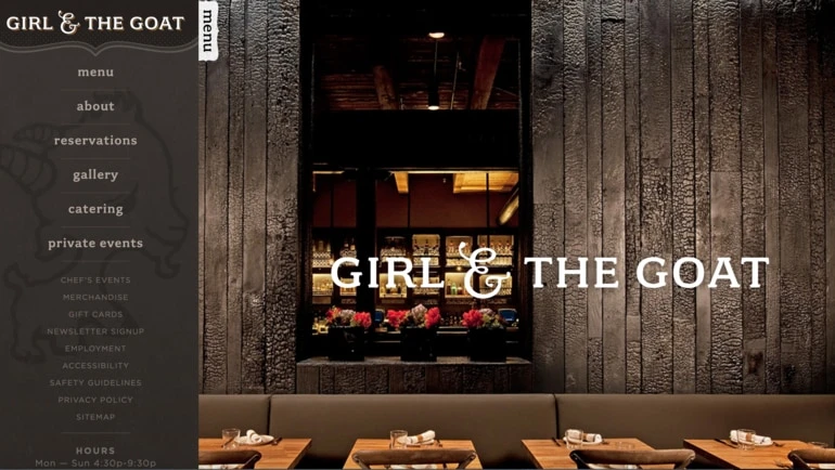
Chicago’s Girl and the Goat makes use of a sleek side navigation bar with all of the relevant information and links laid out in an easy-to-navigate order.
2. Tiki Chick – New York City, New York
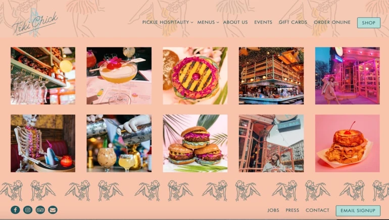
The website for New York City’s Tiki Chick reflects the brand’s fun ethos with bright colors and tropical restaurant branding. The site also uses an embedded Instagram feed to give users a visual taste of its colorful cocktails, tropical eats, and modern interior.
3. Sunday in Brooklyn – New York City, New York
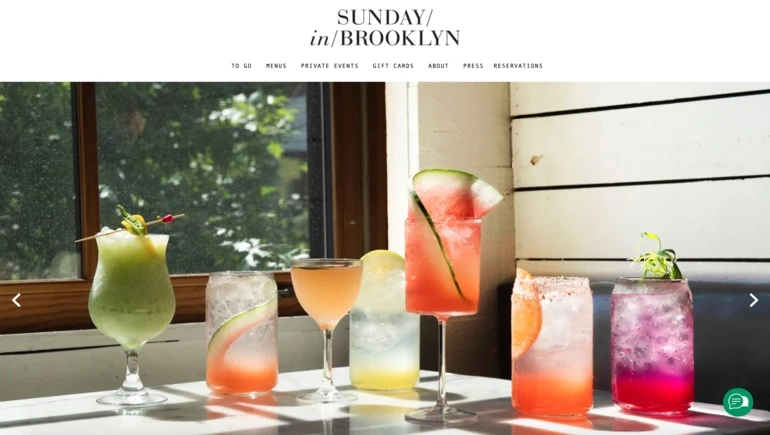
Brooklyn brunch spot Sunday in Brooklyn’s clean navigation bar makes it easy for customers to navigate to different parts of the website, while the high-quality images capture the eye.
4. Mizlala – Los Angeles, California
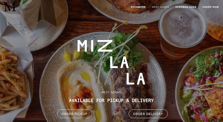
The homepage for Los Angeles’ Mizlala restaurant uses high-quality food photography to draw visitors in, while the clear call to action (CTA) buttons for pickup and delivery make it easy for users to navigate to the correct ordering platform.
5. 1751 Sea and Bar – Houston, Texas
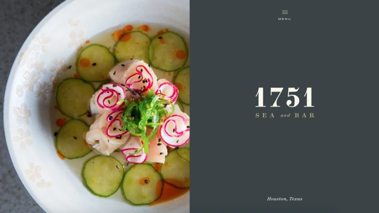
Houston’s 1751 Sea and Bar uses a moody grey color scheme, minimal text, and high-quality photos to immediately convey an upscale dining experience.
6. Colletta – Alpharetta, Georgia
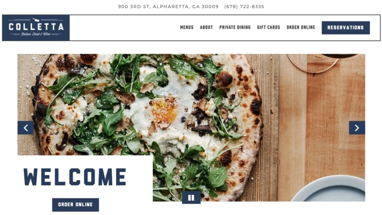
Georgia’s Colletta restaurant draws in a visitor’s attention with its clean and modern restaurant website design. The brand also uses standout CTA buttons to make it easy for customers to immediately order online or make a reservation.
7. The Gambling Stick – Nashville, Tennessee
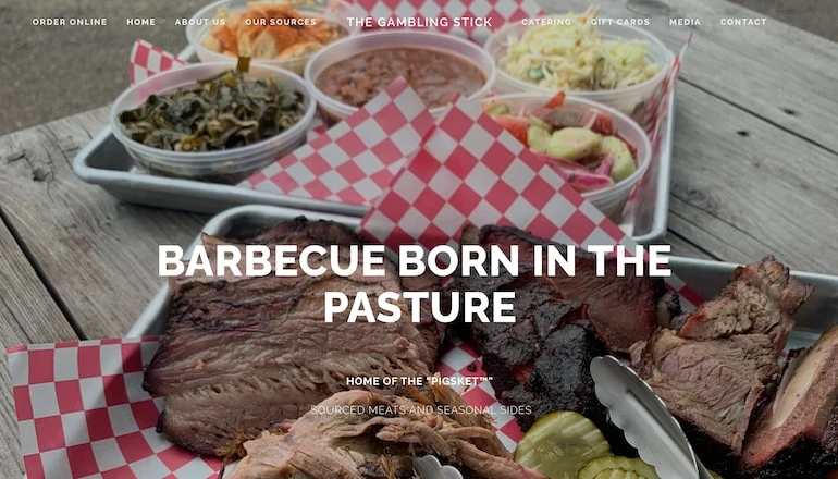
The restaurant website for The Gambling Stick immediately lets customers know about its specialty by putting “Home of the ‘Pigsket’” front and center on its homepage. When paired with mouth-watering photos, this site makes it overwhelmingly clear to online visitors that this is a top spot for BBQ.
8. High Street Deli – San Luis Obispo, California
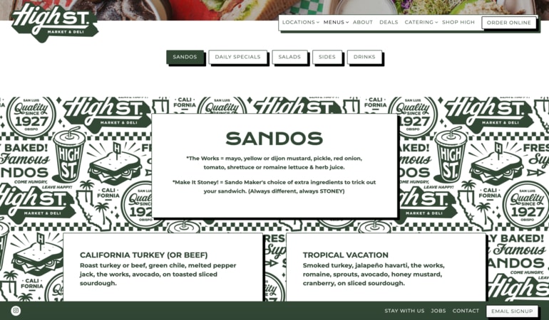
The website for California sandwich shop High Street Deli has a separate navigation bar for its online menu, making it easy for consumers to browse the restaurant’s delicious offerings.
9. Bhuna – Portland, Oregon
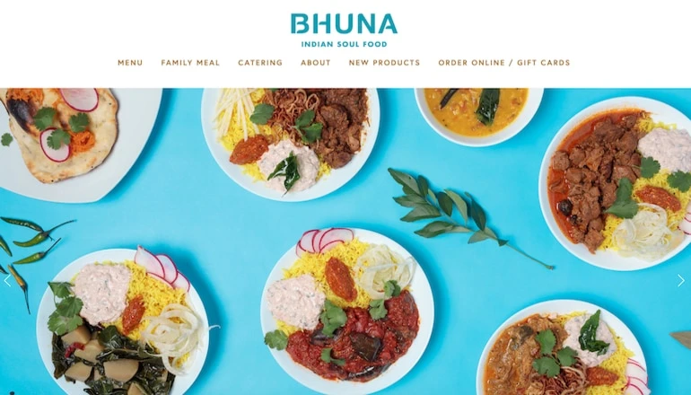
The best restaurant websites will make your stomach growl and Indian soulful spot Bhuna manages to do just that with high-quality images of its tasty dishes. The restaurant also makes great use of bright background colors that match its logo to create a unified color scheme.
10. Eem – Portland, Oregon
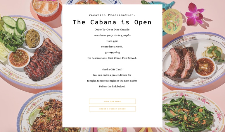
While Eem’s restaurant website is fairly bare-bones, the venue has strategically used background imagery and minimal text to convey all the essential information customers need.
11. House of Small Wonder – New York City, New York
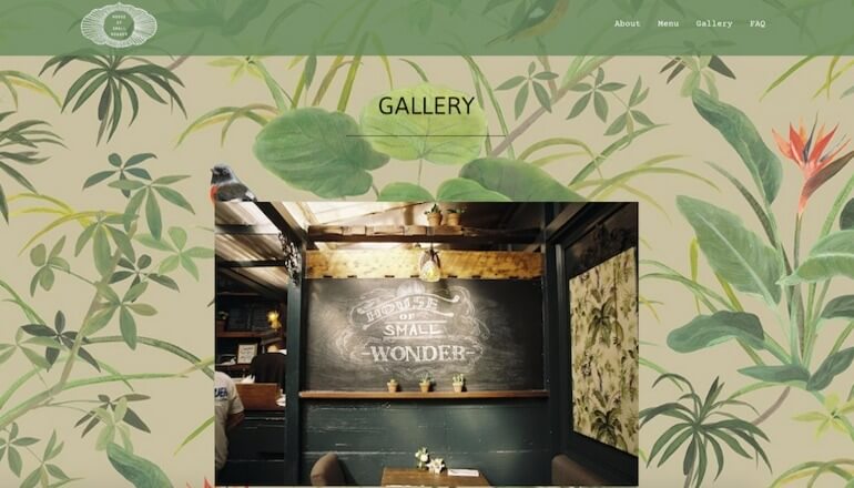
Brooklyn restaurant House of Small Wonder’s website includes a dedicated gallery page that gives users a glimpse of its Instagrammable interior.
12. Meals By Genet – Los Angeles, California
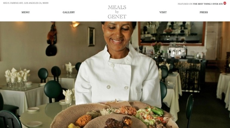
Los Angeles-based Ethiopian restaurant Meals by Genet used high-quality images of owner Genet Agonafer, the food, and the dining room to show consumers they can expect traditional Ethiopian cuisine in a casual bistro setting.
13. Biderman’s Deli – Austin, Texas
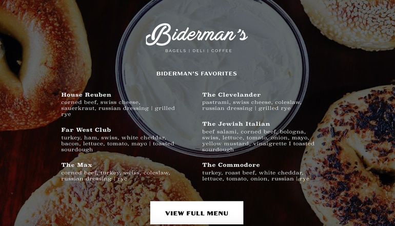
The website for Austin’s Biderman’s Deli cleverly gives online visitors a peek at its most popular dishes directly on the homepage, so they can get an idea of what’s on the menu before navigating to the dedicated menu page.
14. Big Gay Ice Cream, New York City, New York
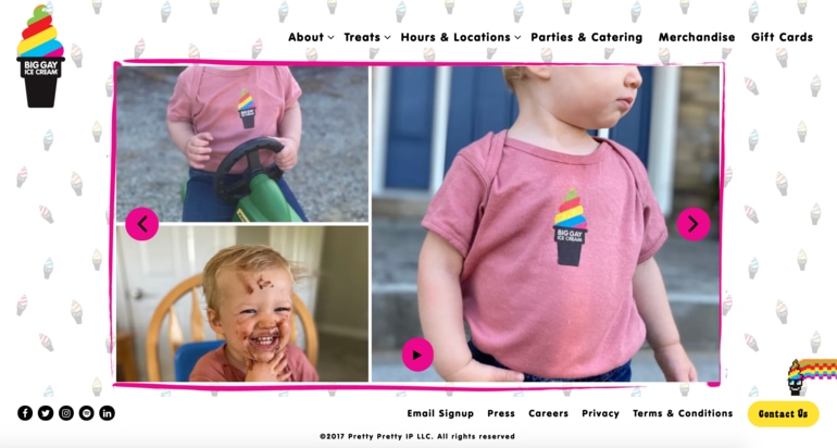
Big Gay Ice Cream is a fun and vibrant brand with a strong focus on philanthropy. The brand’s website reflects this with a whimsical homepage that showcases the brand’s happy little customers and its delicious ice cream flavors.
15. Cafe Flora – Seattle, Washington
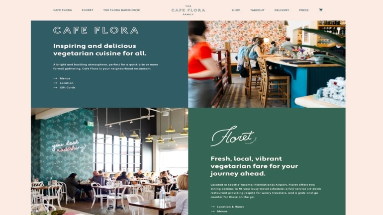
The website for Seattle’s Cafe Flora uses a grid layout, which makes it easy for customers to explore the brand’s various restaurant concepts and access the menu for each location.
16. Harbinger – Des Moines, Iowa
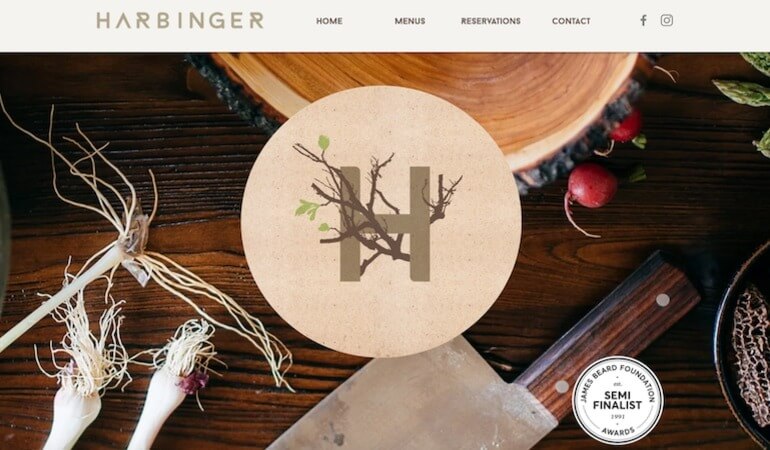
Harbinger is helmed by chef Joe Tripp, who has earned a whopping seven James Beard nominations for Best Chef Midwest. The restaurant proudly shows off its chef’s credentials by including a James Beard Foundation Award badge above the fold on its homepage – you can’t miss it!
17. Pirate’s Bone Burgers – Kansas City, Missouri
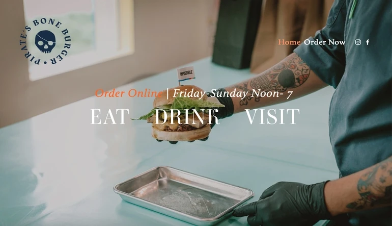
Pirate Bone Burgers makes its website extremely easy to navigate by directing users to its food menu, its drink menu, or a page with dine-in information. The restaurant’s business hours are also listed upfront so it’s easy for customers to find out exactly when the restaurant is open.
18. Dasher & Crank – Miami, Florida
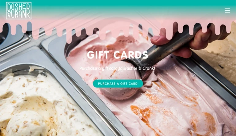
Miami-based ice cream shop Dasher and Crank’s website stands out from the competition with its eye-catching pastel pink and blue color palette, and a creative navigation bar that resembles melted ice cream.
19. Leo – New York City, New York
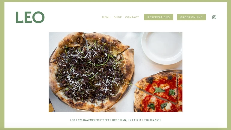
Williamsburg pizza joint Leo doesn’t crowd its restaurant website with unnecessary information or images – everything customers need to know is located in the top menu bar.
20. Two Locals Brewing Company – Philadelphia, Pennsylvania
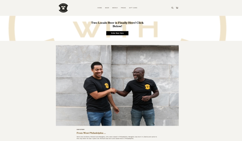
Two Locals Brewing Company is one of Pennsylvania’s first Black-owned breweries and Philadelphia’s first. Their website highlights the important history of the brewery and its founders by featuring an “Our Story” section and a picture of the founders right on the homepage.
21. Hidden – Miami, Florida
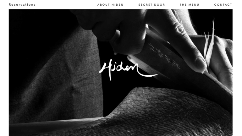
Though Miami’s Hidden is all about secrecy, the restaurant’s website manages to strike the perfect balance between mystery and practicality. You won’t find the restaurant’s address, but you will be able to easily browse the menu or make a reservation.
22. Kokomo – New York City, New York
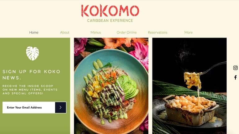
While most restaurant websites hide the email signup form at the bottom of the page, Brooklyn Caribbean spot Kokomo makes it easy for customers to get the latest updates by putting its newsletter form above the fold.
23. El Five – Denver, Colorado
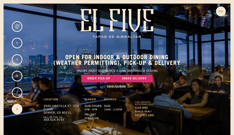
Instead of a traditional navigation bar along the top, the restaurant website for Denver’s El Five uses a series of numbers along the left-hand side of the page.
24. Bottlehouse – Seattle, Washington
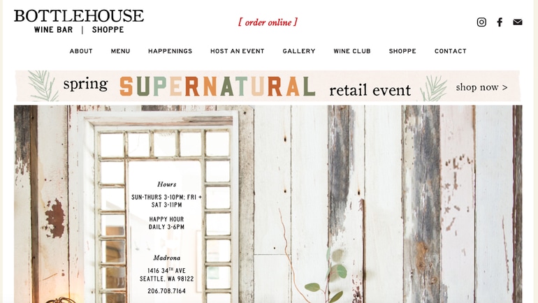
The website for Seattle’s Bottlehouse features an eye-catching banner just below its navigation bar, which allows the restaurant to promote current events like a sale in its online retail shop.
25. The General Muir – Atlanta, Georgia
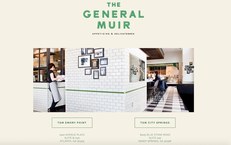
The General Muir has two locations in Georgia, each with its own address, phone number, and reservation platform. To make sure online visitors find the information for their desired location, the restaurant’s website seamlessly directs users to the correct page for each venue right off the bat.
26. Ruckus – Boston, Massachusetts
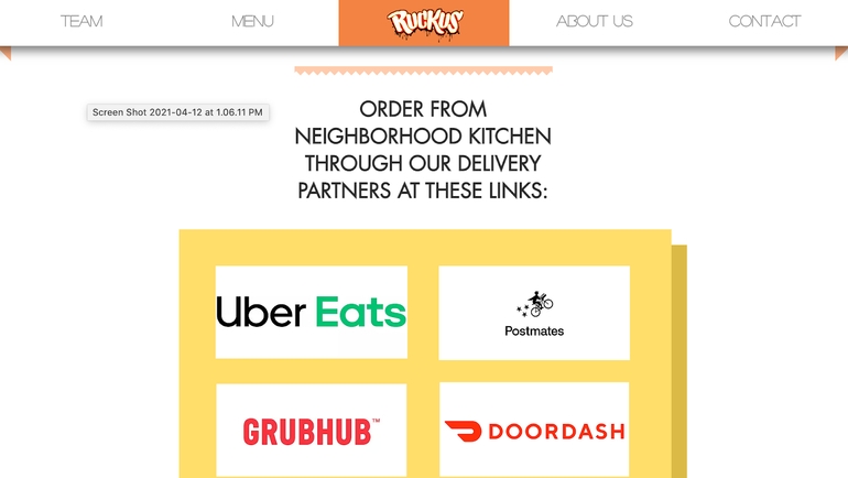
Like many restaurants, Boston noodle house Ruckus offers takeout and delivery from multiple third-party partners. Ruckus’ restaurant website makes it easy for users to select the delivery partner of their choice with highly visual branded icons.
27. Hai Hai – Minneapolis, Minnesota
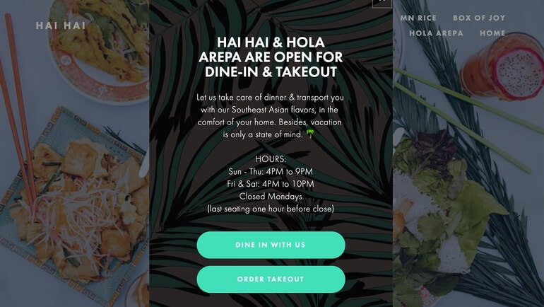
Before you even begin navigating the website for Minneapolis’ Hai Hai, you’re presented with a pop-up that lets you select whether you’re dining in or ordering takeout. This pop-up ensures that users who are ready to dine or to order online can find what they need immediately, while other visitors can simply close the pop-up and browse the site at their leisure.
28. Grey Ghost – Detroit, Michigan
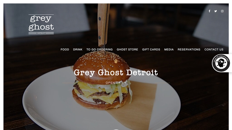
On Grey Ghost’s website, the navigation bar sits in the center of the page, rather than at the top, ensuring that it’s the first thing users see when they visit the homepage.
29. Bibi Ji – Santa Barbara, California
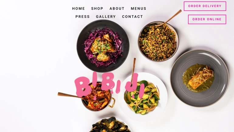
While the restaurant website for Santa Barbara’s Bibi Ji makes great use of eye-catching colors and creative fonts, the use of negative space helps to prevent the page from looking cluttered or overwhelming.
30. Elizabeth’s Restaurant – New Orleans, Louisiana
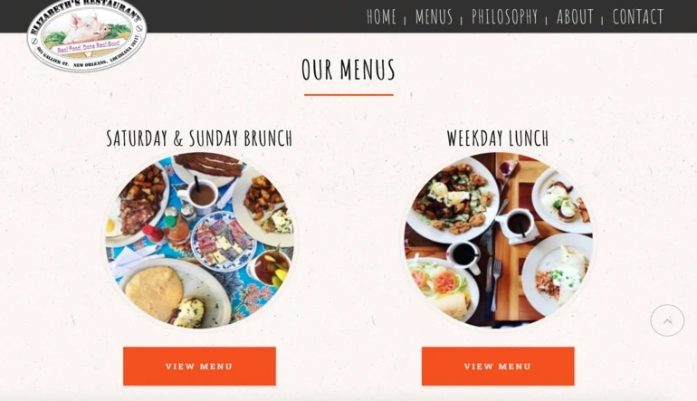
Elizabeth’s website makes it easy to find both its weekend and weekday menus by clearly separating the two on its homepage and assigning a distinct, colorful CTA button to each.
Restaurant Websites: Canadian Examples
Here is a compilation of several great restaurant websites of Canadian businesses:
31. Sweet Jesus – Toronto Ontario
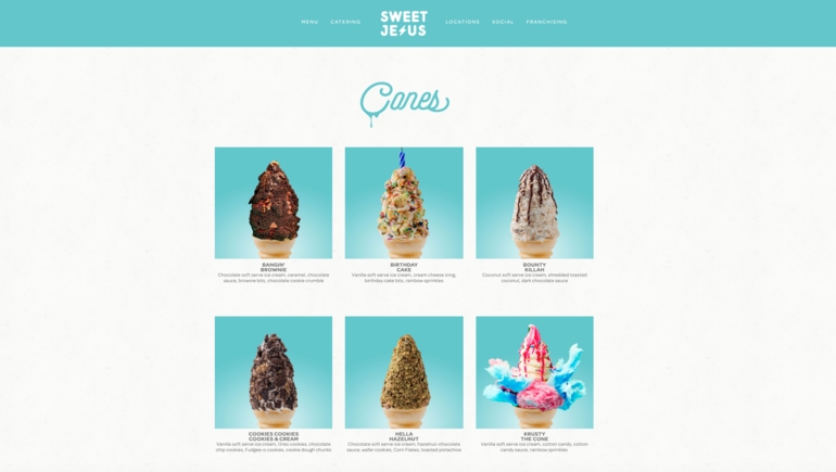
Toronto ice cream purveyor Sweet Jesus uses an eye-catching grid layout and tantalizing photos to display its menu – an especially clever tactic for an ice cream shop that serves up some of the city’s most Instagramable cones.
32. Chubby’s Jamaican Kitchen – Toronto, Ontario
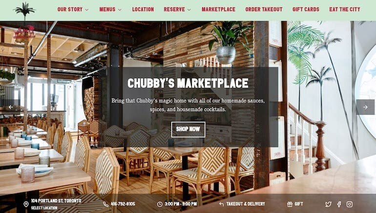
Chubby’s Jamaican Kitchen in Toronto has made its website easy to navigate by making use of both the top and bottom navigation bars. The restaurant also uses an edge-to-edge picture carousel with clear CTA buttons to highlight important links such as its online marketplace.
33. Ask for Luigi – Vancouver, British Columbia
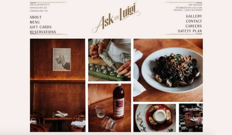
Vancouver hotspot Ask for Luigi gives customers a taste of its food, drinks, and venue by making clever use of a gallery layout on its homepage. These high-quality images also complement the overall color scheme to create a unified design across the webpage.
34. Fable Ice Cream – Saskatoon, Saskatchewan
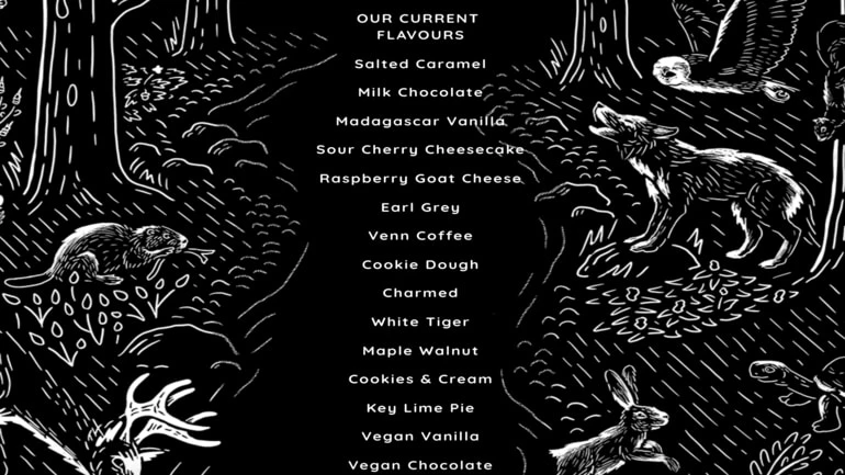
Saskatoon’s Fable Ice Cream uses a sleek black and white color scheme, along with fairytale-inspired illustrations to display its menu and convey the restaurant’s unique brand identity.
35. Reign – Toronto, Ontario
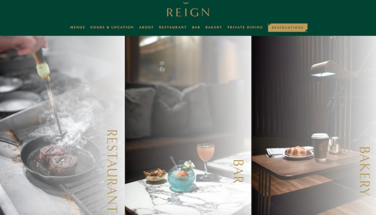
Toronto’s Reign is a sophisticated Canadian Brasserie and its website exudes the same tone with grandiose imagery of its dishes, cocktails, and rich interiors. The accordion design also offers visitors a unique way to navigate to their desired page.
36. Pai – Toronto, Ontario
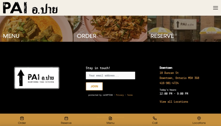
Toronto’s Pai Northern Thai Kitchen includes a clear subscriber form on its website, encouraging online visitors to provide their email so they can stay up to date on the restaurant’s latest news.
37. Arts Café – Montréal, Québec
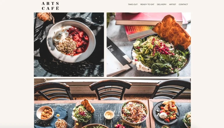
All of the images used on the Arts Café website are done in the same warm style to give the restaurant a cohesive look and feel – all without making the homepage look crowded.
38. Prince Edward Island Brewing Company – Charlottetown, Prince Edward Island
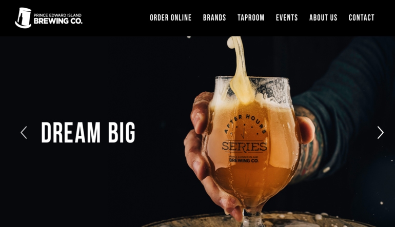
The Prince Edward Island Brewing Co.’s website immediately draws attention with eye-catching images and a dark color scheme that conveys just how seriously the brand takes beer.
39. Mon Lapin – Montreal, Quebec
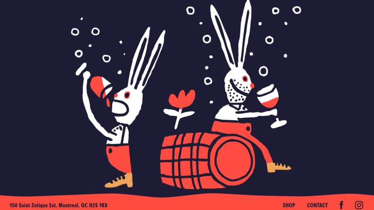
There’s nothing more eye-catching than creative graphic design. The website for Montreal’s Mon Lapin succeeds in capturing the user’s attention with an illustration of two wine-drinking rabbits that disappears in a wash of red as you scroll down the page.
Restaurant Websites: International Examples
Here is a compilation of several cool restaurant websites of businesses around the rest of the world that you can draw inspiration from:
40. Gazzo – Berlin, Germany
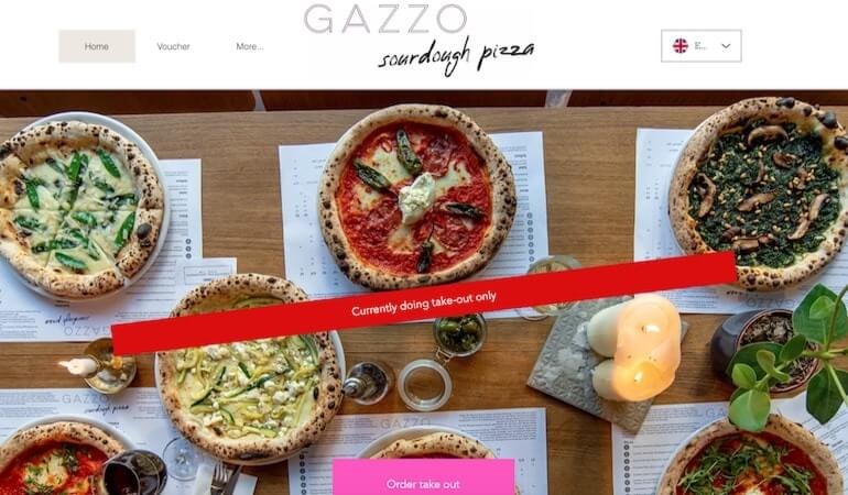
The website for Berlin’s sourdough pizza spot Gazzo tempts visitors with high-quality visuals of its various pies, while the bright red banner and pink CTA button guide visitors directly to the restaurant’s online ordering system.
41. Nour – Sydney, Australia
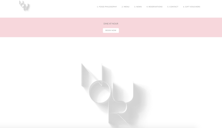
Thanks to its minimalist design and clear CTA button, Nour’s website seamlessly directs visitors to its online reservation page.
42. Norman South Yarra – Melbourne, Australia
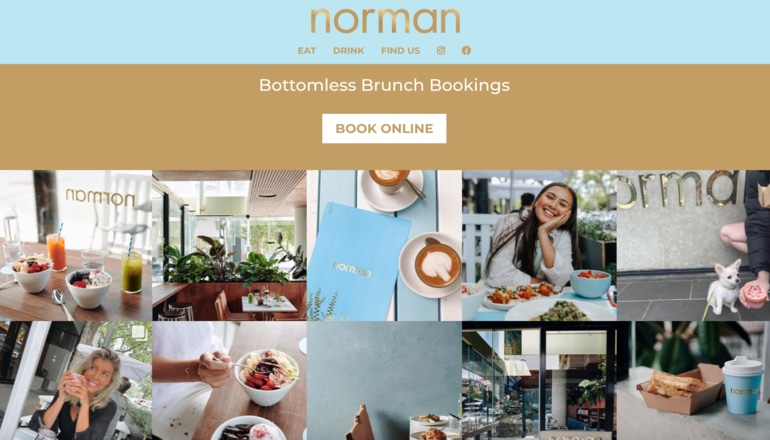
Your social media channels can be a valuable marketing tool – especially your restaurant Instagram account. Norman’s restaurant website makes great use of an embedded Instagram feed to give online visitors a peek at its offering and encourage them to follow the restaurant on social media.
43. Factory Girl – Berlin, Germany
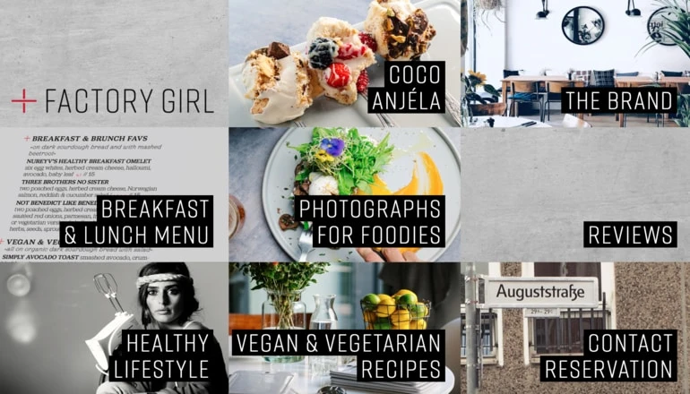
Berlin brunch spot Factory Girl uses a visual grid pattern instead of a traditional navigation bar to display each of its pages.
44. Thundercut Alley – Dublin, Ireland
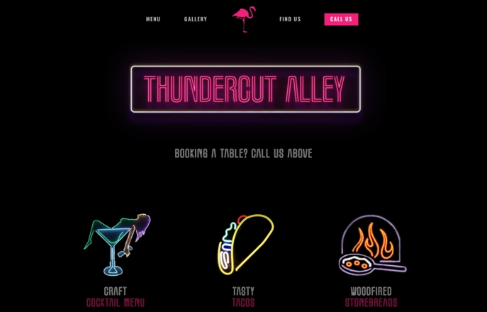
Thundercut Alley is a quirky hidden retro spot in Dublin and the restaurant has ensured its website matches that brand identity by using neon light-inspired fonts and imagery.
45. Blend Station – Mexico City, Mexico
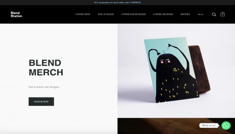
Mexico City cafe Blend Station is well known for its quirky designs and the brand makes it easy for customers to shop for products directly on its website by promoting its online store.
46. Fat Cow – Singapore
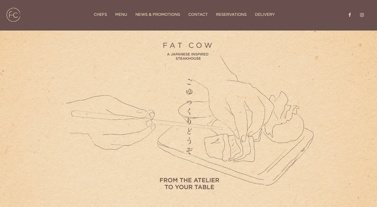
Both Fat Cow’s restaurant and website take a contemporary approach to the Japanese “Wabi-Sabi” concept – the art of finding beauty in things modest, simple and humble.
47. Quay – Sydney, Australia
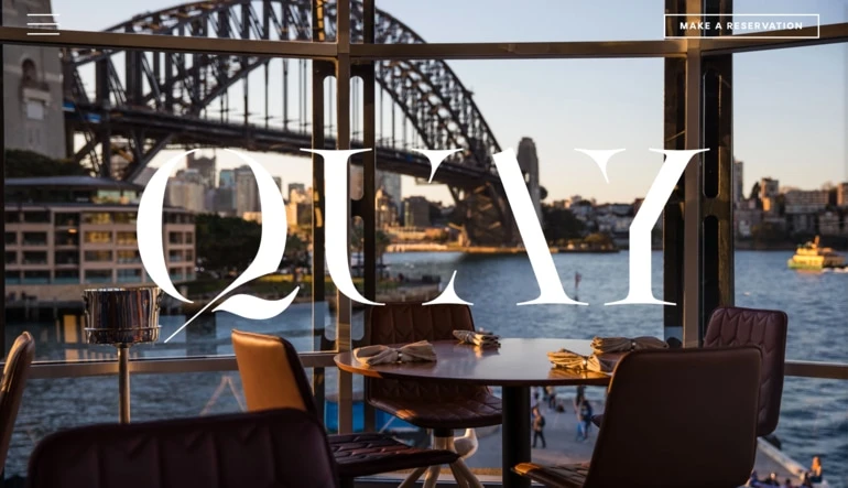
Quay knows that its diners come for a high-end meal with a view, which is why the restaurant has made one of its best tables the primary image for its homepage and cleverly placed the “Make a Reservation” button in the top right corner.
48. Isses – Munich, Germany
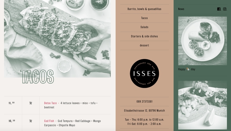
Isses is an authentic Mexican restaurant, and its southwestern visuals and muted color scheme help to convey that brand identity. The website also takes advantage of a unique structure, with the navigation bar in the center and a scrollable menu on the left-hand side.
49. Verjus – Paris, France
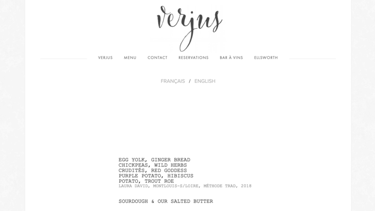
Though Verjus is located in Paris, the restaurant is run by two Americans and is popular among international visitors. To accommodate French and English speakers alike, Verjus’ restaurant website allows users to view the menu in either language thanks to a handy toggle button below the navigation bar.
50. Chuntify – Berlin, Germany and Lisbon, Portugal
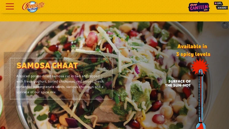
The website for Indian spot Chuntify tantalizes visitors by highlighting some of the restaurant’s star dishes in a rotating image gallery. Menu descriptions are also included alongside each image to educate those who might be unfamiliar with the cuisine.
51. Chye Seng Huat Hardware Coffee Bar – Singapore
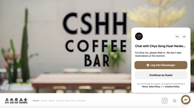
Though not every restaurant website needs one, a chatbot connected to Facebook Messenger can be a great way to connect with your website visitors in real-time – something Singapore’s Chye Seng Huat Hardware Coffee Bar does well.
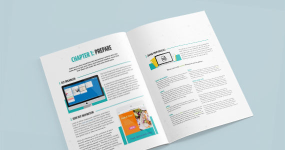
A step-by-step guide for website planning and creation.
5 Online Tools for DIY Restaurant Website Design
Now that you have all these examples of restaurant websites you can draw inspiration from , you’re probably wondering how to create a restaurant website of your very own.
Luckily, building your own restaurant website from scratch is easier than you might expect thanks to the plethora of website builders now available – some of which are even free! Website builders are essentially tools that help you construct and customize a website without manual code editing. This means that you can create a complete website for your business without the need to hire a web developer.
To help you get started, we’ve rounded up the top builders for DIY web design for restaurant websites.
1. Squarespace
Squarespace is one of the most popular website builders for restaurants because it offers dozens of different website templates designed specifically for restaurants. Unlike more general website templates, Squarespace’s restaurant-specific templates come with unique features, like a built-in menu page. Squarespace also offers an eCommerce option in case you want to set up an online shop.
2. Wix
Wix is another popular choice for restaurant websites. Wix’s strengths are that it’s a beginner-friendly tool and it offers a lot of creative freedom, including a fully customizable menu widget, phone ordering setup, and a reservations app.
3. Weebly
If you’re looking to get your website up and running quickly, Weebly is a great option to help create good restaurant websites. Though the designs may not be as polished as you’d get with some other website builders, Weebly is a reliable tool that will help you push a website live with minimal hassle.
4. GoDaddy
GoDaddy is one of the easiest website builders out there, with several restaurant-specific templates to choose from – all of which are mobile-responsive. And while GoDaddy offers some great features such as direct integration with your social media channels, it’s worth noting that you’re somewhat limited in terms of how much you can customize your website with this builder.
5. WordPress
If you’re a little more familiar with the technical side of restaurant website design, WordPress is the perfect website builder for creating great restaurant websites.. Though it comes with a steeper learning curve than other online website builders, WordPress is unmatched in terms of its power and flexibility.

A step-by-step guide for website planning and creation.
With diners spending more time online than ever before, there’s never been a more crucial time to have a proper restaurant website. In many cases, your website is the first thing diners will see before placing an order or dining in, so it’s important to make a good impression. With inspiration from 51 of the best restaurant websites and a little help from an online website builder, you’re now ready to create your own eye-catching website.
Free social media templates for your restaurant
Sign up for our free weekly TouchBistro Newsletter


